
UC San Diego WebReg
WebReg is an online system for course registration and grade distribution; it serves as a "one-stop shop" for university students. The goal is to cater the enrollment experience to the user's academic background and redesign current features to be more intuitive. It allows for seamless access to course and professor information, and personalized degree recommendations for an efficiency in course registration.
Role
Product Designer
Duration
Spring 2023
(10 weeks)
Tools
Figma
Team
Anjali Mathi
Christine Nguyen
Sarah Liu
Tanisha Mandal (Mentor)
Rajvir Logani (Mentor)

working hard 👩🏻💻

team 🌱

after presentation celebration 😊
THE PROBLEM
Enrollment creates additional anxiety on existing stress levels experienced by the students.
Each school year, UC San Diego students face the challenge of enrolling in high-demand courses during their designated enrollment period. This often leads to concerns about course availability, full waitlists, and unmet prerequisites – all of which creates additional anxiety on existing stress levels experienced by the students. How might we help UCSD students optimize their current enrollment experience?
SOLUTION
Provide a comprehensive course enrollment hub.

Course Recommendations Tool
-
Information personalized to each student’s Degree Audit
-
Accessible on every page
-
Courses are offered for that quarter and meet prerequisite requirements


Overhaul of the Existing Interface
-
Streamlined layout for user-friendly course listings
-
Developed a clear visual hierarchy using a design system
-
Remove duplicated features


Course & Professor Evaluations (CAPE) Pop-up
-
Does not require going on a secondary website (e.g. Rate My Professor, Reddit)
-
Hyperlinked syllabus and resources for easy access
-
View evaluations from previous quarters


USER INTERVIEWS
Understanding our classmates.
I worked alongside my team to analyze 30 responses gathered from our Google Survey on users' demographic, positives, and challenges with WebReg. Half of the survey respondents opted-in for our 30 minute interview, which was a walk-through of how they would plan courses for the upcoming quarter.


FROM SURVEY
Research Questions
1. What is your major and minor (if applicable)?
2. How many units are you currently taking this quarter?
3. What do you use WebReg for?
4. What do you like about WebReg?
5. What challenges do you have with WebReg?
FROM INTERVIEW
Walk-through Questions
1. Can you walk me through how you typically access WebReg?
2. Do you generally find it easy to enroll in the classes you want?
3. How do you handle challenges like class schedule conflicts, unavailable courses, prerequisites, or being on a low position on a waitlist?
4. How do you plan your course schedule to ensure you're on track for graduation?
USER INSIGHTS
Cross-referencing becomes crucial due to the absence of critical course information.
Based on the responses, I noticed trends in the challenges that users face when using the online system for course enrollment for their course planning process. From affinity mapping, I was able to discover that users need to utilize alternate tools to ensure successful course enrollment because the current interface and insufficient capacity of the website infrastructure works against their motivations.
.png)
MAIN INSIGHT
Pain points for UC San Diego students.
User Interface
WebReg is unappealing, difficult to navigate, and not mobile friendly. Users are likely to go on WebReg for non-enrollment functions.
Lack of Course Info
WebReg users often need to cross-reference many sites, as many key features are hidden or not intuitive.
Searching & Class Conflicts
Search results for classes on WebReg only return specific inputs; users are left with the cognitive load of navigating course details and class conflicts by themselves.
USER PERSONA

WIREFRAMING v1
Creative exploration, with room to pivot as needed.
After stakeholder feedback, I recognized that our initial designs should leverage WebReg's existing features instead of adding tools, such as a new calendar feature, since many users already utilize alternate softwares that serve the same purpose (e.g., Sheets, Calendar). It was time to iterate again - though I did reuse my Course info pop-up.

Course info pop-up

Personal calendar
WIREFRAMING v2
Transformed visual hierarchy & overall application usability.
Reflecting back on our proposed solutions, it was important to not to steer away from current branding but enhance the layout so readability can be improved. I focused on improving the hierarchy of information so there is an emphasis on the course titles (as the header) to ensure that course information following is self-explanatory.
HOME PAGE SECTIONS

1. Selection of academic term (first page)
.png)
2. Home page (schedule & finals list)

3. Calendar
SEARCH RESULTS

1. Search results after entering "cogs"

2. Course description expansion

3. Prerequisite warning
FINAL DELIVERABLE
High-fidelity prototype.
Home Page
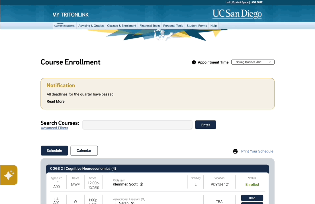
Restructured visual hierarchy to place importance on course title and unit amount as primary headers for each respective section, streamlining access to enrollment status and course details. Transformed 'Enrollment and Registration Information' into a 'Notification' section to present crucial information, minimizing distractions. Eliminated non-functional features such as "My Schedule: Create new copy, rename" and "Add Event".
ORIGINAL

REDESIGN
.png)
Finals List
To enhance readability, I replaced the current "Finals" tab with a visual representation of the same information.
ORIGINAL

REDESIGN
.png)
Search Results & Course Expansion
Improved navigation by vertical alignment of "Show X" and number of courses found; also placed pagination at the end of the search results for better usability and reduced the number of courses displayed per page. Minimized information congestion from organizing discussion sections by enrollment availability and enhanced course detail readability. Prerequisite warning icon displayed for courses with unfulfilled prerequisites.
ORIGINAL

REDESIGN

FINAL DELIVERABLE
Comprehensive design system for WebReg.

MEASURING SUCCESS
Key Performance Indicators (KPIs) to evaluate goal alignments.
Reach
Support growth in users and number of visits for 40k+ students, reduce number of site crashes.
Function
Repair current pain points and outperforms previous iteration, A/B testing.
Satisfaction
Increase in user satisfaction with UI and overall system, user input surveys.
Retention
Support growth in users and number of visits for 40k+ students, reduce number of site crashes.
NEXT STEPS
Future enhancements.
-
AI Academic Advising Counselor | In-site AI chat box where users can ask questions and get answer instantly, reducing the wait time.
-
Auto-populate Class Schedules | Generate and propose class schedules for the following quarter based on remaining requirements.
-
Appointment System | Weighted algorithm based on year, class size, and units left, fairer system. This is currently a work in progress; view what we're working on here!
REFLECTION