.png)
Venmo Design Exploration
Venmo is a payment transaction app that allows users to send and receive money online. As a team, our task was to uncover usability problems on Venmo's mobile interface and present our design approach to 50+ stakeholders. As the lead UX Designer, I worked to redesign Venmo’s interface to enhance its social connectivity by implementing an accessible friends list for users and making P2P transaction features more intuitive.
Role
UX Designer & Researcher
Duration
October 2021
(3 days)
Tools
Figma
Team
Epsilon Pledge Class at Alpha Kappa Psi, Nu Xi
THE PROBLEM
The importance of social connectivity should be balanced with financial functionality.
With over 76 million users, Venmo has gained popularity in the P2P payment platform realm by addressing the inefficiencies of traditional transactions. Given its emphasis on connectivity, there was an opportunity to further this business goal by enabling users to view and invite their social network to use Venmo for sending money. Every transaction has a story behind it; users should be able to reflect and keep track of charges after engaging in activities with friends.
Being unable to view your friends presents a disruption in payment flow. How might we optimize Venmo’s interface to streamline peer-to-peer transactions and ensure easy access to payment history to improve overall user experience?
SOLUTION
User-friendly, intuitive designs to streamline transactions.
Friend's List
-
Hyperlinked text for visual preview of number of friends and for easy access
-
Find, locate, and differentiate friends
-
Friend requests are found in "Notifications" tab for alerts
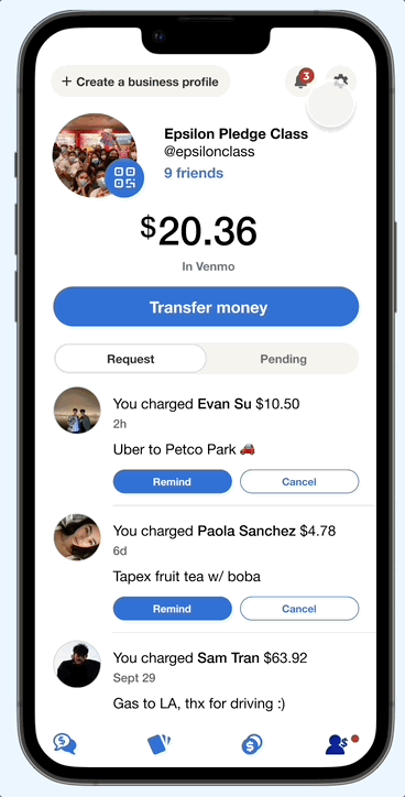

Request & Pending Tabs
-
View charges and requests on one tab
-
Ability to remind users of requests sent
-
Real-time Venmo wallet balance change when requests/charges are fulfilled
Improved Transactions Searchability
-
Centralized the transaction history of personal and friends into one tab
-
Search bar implementation to find for friends, people, and businesses

USER RESEARCH
Trendy features can be a "double-edged sword" when it comes to meeting expectations.
As active Venmo users and college students, we were able to reflect on our personal experiences using this platform when sending money or charges and occasionally viewing friends’ transactions out of curiosity. In fact, our target audience was seemingly in a similar age range - approximately 83% of Venmo users fall into the 18 to 34 category (via RightMetric).
We conducted 13 semi-structured interviews with users that belonged to this target demographic. It uncovered multiple insights about the user experience and how it could be improved.
MAIN INSIGHTS
Friends
"I cannot find friend request from others or see who has added me; it's not easy to see friends list."
Transactions
"I want to see pending and past transactions. I cannot search for friends in my transaction history."
Accessibility
"It's complicated to check who hasn't completed payments or finding requests sent to me."
Cryptocurrency
"I cannot use cryptocurrency in any way besides to buy or sell. There is also a very limited selection."
Through our user interviews, we discovered that a majority of the interviewees had trouble with accessing information across different areas of the app - whether it'd be finding their social network or making sure that payments were sent from either party. The transaction history is set chronologically, which makes it difficult to search for specific payments from the past.
Additionally, not all our interviewees were fond of the cryptocurrency feature as they (1) did not use it or (2) thought its features were too limited.
USER PERSONAS


MARKET RESEARCH
Analysis of existing popular P2P payment platforms.
I decided to evaluate competitors’ user interface on their mobile applications but also focus on specific components that were gathered from the main insights. This includes payment methods, social connectivity, cryptocurrency, and overall display of information.

Cash App
INTERFACE FEATURES
-
List format for transaction history with details like amounts and dates
-
Recent recipients only and option to sync contacts
-
Cryptocurrencies: Buy, sell, and hold Bitcoin
COMPETITIVE EDGE
-
Emphasis on simplicity, privacy, and a broader range of financial features
Zelle
INTERFACE FEATURES
-
Can be used through online banks and credit unions (e.g., Chase, Capital One)
-
Recent recipients at the top and registered recipients transferred from contacts list are displayed
-
Optional memo attached (140 characters limit)
COMPETITIVE EDGE
-
Emphasis on security and the speed of payments

AFFINITY DIAGRAMS
Prioritizing optimal solutions within a time constraint.
We brainstormed solutions by each writing our findings into virtual ‘post-its’. After categorizing and removing redundant ones, we discussed which key features best served our users’ pain points. Time was our biggest constraint that we kept in mind when choosing.

Improvement Areas
-
Users value the social feed but prioritize profile features first
-
Notifications are disorganized and hard to navigate
-
There is an opportunity to centralize transactions history into one tab
-
Hard to find friends, transactions, and requests/charges without search function
-
Cryptocurrency is limited and high transaction fees deter users from buying
SKETCHES
Framework before it's used in a testable environment.

PROFILE
Primary features located here: friend's list, incomplete charges/requests.


CRYTOCURRENCY
An option for users to remove crypto from their interface.

TRANSACTION HISTORY & FRIEND FEED
Users can view their personal transaction history and friends feed in one place. Search bar implementation to find people and specific transactions.
HIGH-FIDELITY PROTOTYPE
Our final designs highlight changes to improve the visual and interaction design of the product.
Profile
.png)
ORIGINAL
REDESIGN
Transactions History

ORIGINAL
REDESIGN
DESIGN EXPLORATION
Choice to enable cryptocurrency into your experience.
Ultimately, our team decided not to include this feature in our final deliverable since it was not related to social connectivity. However, I still think it's a practical implementation, especially for users who don't partake in cryptocurrency - which is approximately two-thirds of Venmo users (via PYMNTS).

Original Interface
Access Settings
Original: Enabled
Disabled
New Navigation Bar
DESIGN EXPLORATION
Future enhancements.
-
Group Creation & Split Check Incorporation | Create and manage groups for efficient, centralized bill splitting.
REFLECTION
My first design project (yay).
This was my first hands-on experience in becoming familiarized with Product Design, simultaneously learning how to apply the design thinking process to our project. It was an educational experience learning how to utilize Figma, as well as cross-collaborating with my teammates (who also were unfamiliar with design) to create a final prototype that illustrates our ideas collectively. If our team had more time to work on this redesign, we would conduct user testing and go through more iterative cycles to gather insights on improved accessibility of existing Venmo features. This ranges from the size of buttons to the placement of certain functions.
Overall, I found this design sprint to be an incredible experience that solidified my interest towards user experience design - a field I had no knowledge about previously. Thank you Nu-Xi Chapter, my professional mentors, and pledge brothers for their hard work and unconditional support for one another.